Introduction
A Spinner is an outline of a circle that animates around itself indicating to the user that things are processing. A Spinner is shown when it's unsure how long a task will take making it the indeterminate version of a progress indicator. They can be of various sizes, located in line with the content or centered. They generally appear after an action is being processed or committed. They are subtle and generally do not take up much space, but the transition from the completed task.
Sometimes we want to apply some business logic like show loader/spinner while calling API until API responds. So for this, we will call a Graph API to get lists from the root site, and until API response we will show Loader. We will use an Office UI fabric Spinner.
For more information refer to this.
Implementation
- Open a command prompt
- Move to the path where you want to create a project
- Create a project directory using:
md spfx-loader
Move to the above-created directory using:
cd spfx-loader
Now execute the below command to create an SPFx solution:
yo @microsoft/sharepoint
It will ask some questions, as shown below,
After a successful installation, we can open a project in any source code tool. Here, I am using the VS code, so I will execute the command:
code .
Now go to the src > webparts > webpart > components > I{webpartname}Props.ts file,
Here we will create a property for graph Client as below,
import { MSGraphClient } from "@microsoft/sp-http";

export interface ISpfxLoaderProps {
  description: string;
  graphClient: MSGraphClient;
}
Move to the {webpartname}.ts file. Here we will get the graph client and set it to the property,
import * as React from 'react';
import * as ReactDom from 'react-dom';
import { Version } from '@microsoft/sp-core-library';
import {
  IPropertyPaneConfiguration,
  PropertyPaneTextField
} from '@microsoft/sp-property-pane';
import { BaseClientSideWebPart } from '@microsoft/sp-webpart-base';

import * as strings from 'SpfxLoaderWebPartStrings';
import SpfxLoader from './components/SpfxLoader';
import { ISpfxLoaderProps } from './components/ISpfxLoaderProps';
import { MSGraphClient } from '@microsoft/sp-http';

export interface ISpfxLoaderWebPartProps {
  description: string;
}

export default class SpfxLoaderWebPart extends BaseClientSideWebPart<ISpfxLoaderWebPartProps> {

  private graphClient: MSGraphClient;

  public onInit(): Promise<void> {
    return new Promise<void>((resolve: () => void, reject: (error: any) => void): void => {
      this.context.msGraphClientFactory
        .getClient()
        .then((client: MSGraphClient): void => {
          this.graphClient = client;
          resolve();
        }, err => reject(err));
    });
  }

  public render(): void {
    const element: React.ReactElement<ISpfxLoaderProps> = React.createElement(
      SpfxLoader,
      {
        description: this.properties.description,
        graphClient: this.graphClient,
      }
    );

    ReactDom.render(element, this.domElement);
  }

  protected onDispose(): void {
    ReactDom.unmountComponentAtNode(this.domElement);
  }

  protected get dataVersion(): Version {
    return Version.parse('1.0');
  }

  protected getPropertyPaneConfiguration(): IPropertyPaneConfiguration {
    return {
      pages: [
        {
          header: {
            description: strings.PropertyPaneDescription
          },
          groups: [
            {
              groupName: strings.BasicGroupName,
              groupFields: [
                PropertyPaneTextField('description', {
                  label: strings.DescriptionFieldLabel
                })
              ]
            }
          ]
        }
      ]
    };
  }
}
- Move to the {webpartname}.tsx file,
- Create a State with loading and items properties
- Create a constructor and initialize a state
- Create a method getItems() and in this method, we will call a graph API to get lists from the root. And in this method before starting a call API we will set state loading to true and in the response and error function, we will set state loading to false.
- And call getItems() in componentDidMount()
- And in the render() method we will check if state loading is true then show Spinner and if the length of items is greater than 0 then we will show records.
import * as React from 'react';
import styles from './SpfxLoader.module.scss';
import { ISpfxLoaderProps } from './ISpfxLoaderProps';
import { escape } from '@microsoft/sp-lodash-subset';
import { Spinner, SpinnerSize } from '@fluentui/react/lib/Spinner';

export interface ISpfxLoaderState {
  loading: boolean;
  items: any[];
}

export default class SpfxLoader extends React.Component<ISpfxLoaderProps, ISpfxLoaderState> {

  constructor(props: ISpfxLoaderProps) {
    super(props);
    this.state = {
      loading: false,
      items: []
    };
  }

  public componentDidMount() {
    this.getItems();
  }

  public getItems(){
    let graphURI: string = "/sites/root/lists";

    if (!this.props.graphClient) {
      return;
    }
    this.setState({
      loading: true,
    });

    this.props.graphClient
      .api(graphURI)
      .version("v1.0")
      .get((err: any, res: any): void => {
        if (err) {
          this.setState({
            loading: false
          });
          return;
        }
        if (res && res.value && res.value.length > 0) {
          console.log("res: ", res);
          this.setState({
            items: res.value,
            loading: false
          });
        }
        else {
          this.setState({
            loading: false
          });
        }
      });

  }

  public render(): React.ReactElement<ISpfxLoaderProps> {
    return (
      <div className={styles.spfxLoader}>
        <h2>{this.props.description}</h2>
        {
          this.state.loading &&
          <Spinner label="Loading items..." size={SpinnerSize.large} />
        }
        {
          this.state.items.length > 0 && this.state.items.map(m => <p>{m.name}</p>)
        }
      </div>
    );
  }
}
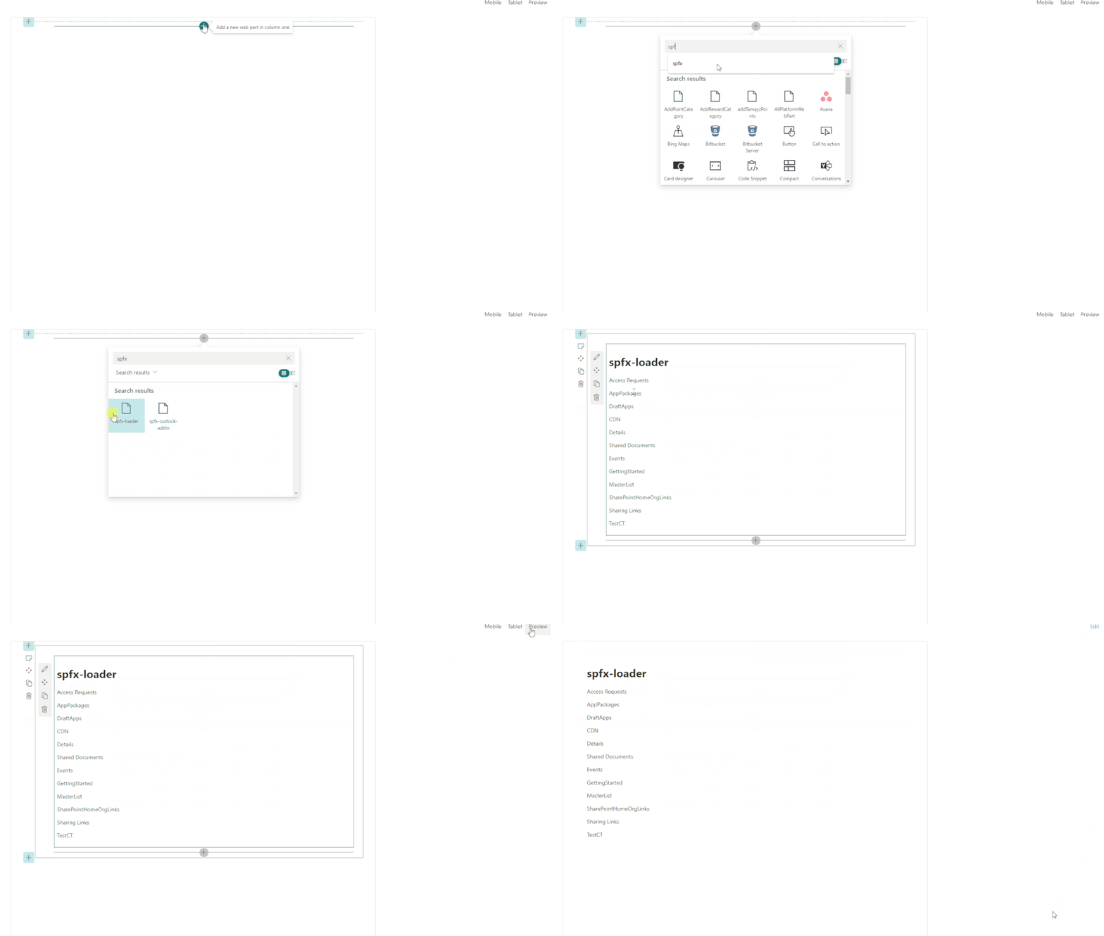
Output
Find the full source code here.
Summary
In this article, we have seen how to use Spinner/loading in the SPFx webpart.
I hope this helps.
Sharing is caring!
Posted at https://sl.advdat.com/3lm6XLE

