Mixed Reality Design Language
Ramiro Torres, Creative Director
Mesh is a great example of the evolution of the Mixed Reality Design Language.
It highlights the evolution of where we come from and where we are heading. It is not a surprise that it feels familiar, but also new. Over the last several years, we have been learning and developing best practices of Design for Mixed Reality, and we have applied these to the Mesh App – bringing together a cohesive, intuitive, and delightful experience.
Every element of the experience has been considered, no matter how big or small. The icons, typography, iconography, 3D UI elements, visual feedback, shaders, transitions, animations, and illustrations all work together to build a holistic product. These relationships help us establish a cohesive visual rhythm in all corners of the Mesh experience.
Brushes and Color Picker
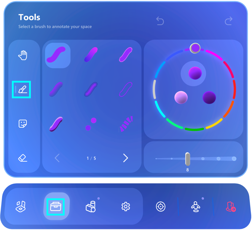
One of the features we are very excited about is the addition of 40 new brushes that allow everyone to express themselves in a collaborative environment, in a way that suits them best. We experimented with a wide variety of brushes that are optimized for uses ranging from simple annotation to more volumetric and expressive brushes with particles, and even metallic materials and artistic brushes to push your collaboration session to the next level. The new color picker also allows for more options, moving from 24 to 36 colors.
Among many of the new design updates is the introduction of 3D buttons for both the color swatches and the brush previews. The new 3D buttons are not just beautiful from a design factor, they are also practical. The 3D brushes buttons allow the user to preview the brush and its color as it will be rendered in the scene. The 3D swatches feel like rubber balls, and they squeeze on press providing gratifying and visible feedback.
The Collaborative Surface
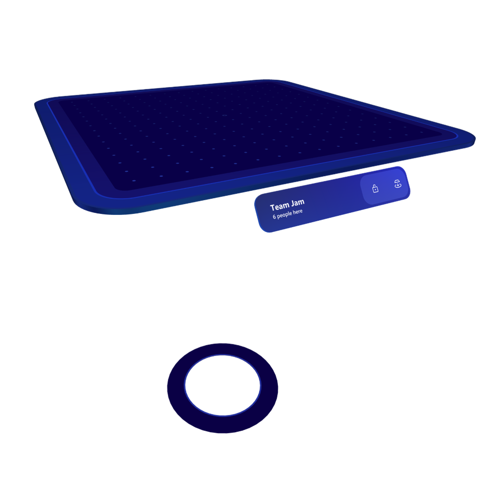
A central UI component in the Mesh experience is the table. In this iteration, we decided to create a surface that is complementary to all other UI elements, while ensuring it was not very intrusive to the experience. We streamlined the design and made the color contrast less dramatic and more minimalistic. This allows people to focus on the collaborative session in front of them when needed and keeps it from being distracting when not in use. We are already thinking forward to additional functionality and collaborative surfaces for future releases.
Bringing Delight to the Experience
One essential goal of our design language is to bring delight into the experience. We have dedicated a lot of energy to refine the big and little gestures of the design, but also some details that are not perceptible but essential for the natural flow of an experience. Subtle transitions help make the experience feel natural. This is visible on the transitions between screens, overlay animations, scrolling behaviors, and loading animations. Another delightful element is found within the tips/tutorials area. We moved from iconographic visualizations to fully volumetric dioramas to help users understand our new features. There is something truly magical when you see these small illustrations of the experience and you can look at them from many angles inside of a 3D window.
Finally, we put a lot of focus on the materials used in the experience. Our shader uses an iridescence behavior that changes depending on the users viewing angle, responding to the user’s physical position. This is a signature element of our design language that we love and have continued to evolve since the first HoloLens. These are just a handful of examples of the work our team has been putting into this delightful experience, and we are super excited to share our learnings with everyone. As always, we are grateful for feedback, and look forward to hearing from you.