Hi, I’m Jordan and I’ve just finished my MSc Computer Science degree at UCL. Before this I worked in a few different industries, from information security (more fun than it sounds) to selling beer (exactly as fun as it sounds), and before that I studied a BA in Music at Durham University. If you’d have told 21-year-old me that I’d end up working with Microsoft and GOSH to develop mHealth software, I would have been surprised (I was going to make it big as a sax player, of course), but ultimately, studying tech has allowed me to combine creativity, problem solving and logic to build tools for good.

Recently I built a progressive web app to be used as part of a medical trial to study how people with cystic fibrosis approach their treatment plans. Cystic fibrosis is the most common lethal genetic disease in Caucasian populations, affecting over 10,000 people in the UK and 100,000 people across the world. It’s impacted my life too; I lost someone I loved to the disease when I was a teenager. Needless to say, I jumped at the opportunity to build a product that could help people with CF live with more choice.
I was the sole developer on the project, but I had Lee Stott from the advocacy team and Prof Eleanor Main from Great Ormond Street Institute of Child Health as my indispensable mentors. Nitya Narasimhan was a huge help getting to grips with all things PWA, and Yohan Lasorsa helped me get my head around auth and notifications. Thanks all of you!
CARE4CF
There is no cure for CF, but a wide range of treatments are used to control the symptoms and reduce complications. For many people with CF, staying healthy means spending an average of two hours every day on these treatments. Daily airway clearance treatments (ACTs), a form of chest physiotherapy used to clear sticky mucus from the lungs, are usually regarded as the worst and most burdensome of these treatments. They are uncomfortable, time-consuming and are often left by the wayside as a result.
Many people with CF choose to replace these ACTs with exercise, moving away from more cumbersome physiotherapy in favour of activities that seem more natural, social and easy to integrate into a ‘normal’ life. With this in mind, the question of whether exercise can replace chest physiotherapy is currently one of the top 10 priorities for research regarding CF. This app forms a central part of the CARE4CF trial, which aims to answer the question:
Can Airway clearance be Replaced by Exercise for people with CF?
Participants in the trial will use the app to log their airway clearance activities every day for 12 months. This will then feed into a study to determine how their health corresponds to the activities they have (or haven’t) done.
Why PWA?
The trial will involve around ~1,000 people with CF of all ages and demographics. It is important for the app to be accessible by anyone, regardless of whether they choose to access via desktop or phone and regardless of device or operating system. It’s also important for the app to run quickly and smoothly - people won’t want to use the app every day if it takes forever to load. I was also keen to make the most of native device capabilities such as push notifications to remind users to engage with the app.
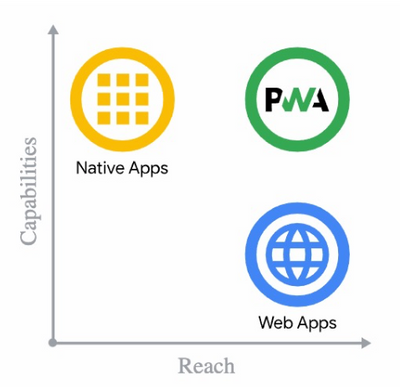
Progressive web apps are a relatively recent development in web technology. They are an enhanced version of a normal web app; they offer installability, offline access, native-like capabilities and a whole load of other benefits. Traditional web apps are accessible by anyone with a browser so they have a really wide reach, whereas native web apps can make the most of the device's fun features. PWAs are the best of both. @Nitya has put together some great resources to learn more about PWAs, and I’d definitely recommend her slide deck for beginners.
Not only did building the app as a PWA give me the chance to get to grips with some of the latest developments in web technology, it allowed me to build a speedy product that combines the capabilities of a native app with the wide reach and portability of a web app.
User Flow
First, users save their ‘normal’ airway clearance routine. They can also save alternative routines and swap between them later.
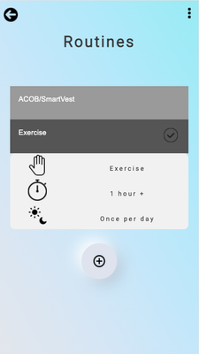
Each day, users enter whether they have:
- Done their normal routine
- Done something different to their normal routine (and if so, what?)
- Completed no activities (and if so, why?)

If a user consistently logs ‘something different’, they are prompted to update their ‘normal’ schedule to better reflect the activities they usually complete.

Users can cycle through the days to see what they’ve logged, and can also see a summary of logging history in a calendar format.

The app gamifies the logging experience by displaying the user’s current logging streak and their longest logging streak so far. Gamification isn’t for everyone (some members of my focus group said they wouldn’t use the app out of spite), so users have the option to turn this feature off.
If a user forgets to log their activities, they will receive a push notification to act as a reminder.

Content Management
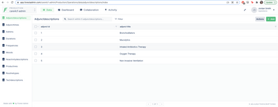
I’m not a medical expert. I’ve been given a list of common techniques and medications that users might want to log, but I don’t know every item that a user might need - users might spot missing items in the dropdown lists or prefer different wording in certain sections. The trial’s administrators will have a much better idea of how to populate these options. To save them the trouble of having to delve into the code, I wanted to provide a user-friendly content management system.
To go about this, I tried to avoid hard-coding the site’s content as much as possible. Instead, I added tables to the database schema to store any dropdown options or important sections of wording, and populated the site dynamically. I used Forest Admin, a free database administration software, to create and deploy an accompanying web app to allow the admins to update the content as they see fit. It also generates some handy visualisations to describe how users are interacting with the app.

Logging In
To handle login and auth, I used the indispensable pwa-auth resource. This is a lightweight web component developed by the PWABuilder team that allows users to sign in using their Microsoft, Google, Facebook or Apple account. The app receives the user’s email address, name and profile picture along with access tokens and other raw data from the provider. In essence, everything you need to register a user and create a persistent login.
Participants for the trial will all have Microsoft accounts, so I stuck with that for the login. I registered the app in the Azure Active Directory to create a Microsoft key, which allowed the system to authenticate users properly. After that, implementing the component was as easy as adding a script tag to the page’s <head> and then a <pwa-auth> button in the html.
Let's Get Progressive
Let's go through some of the features that make the app a PWA.
Installability
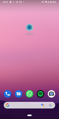
PWAs are installable. This means that users can add the app to their device’s home screen. To unlock this ability, we need to use a web app manifest to include some key pieces of information. The most important pieces of information to include are the app’s name, the app’s icon image (to be used on the home screen) and its starting URL (the app’s home page). I added some extra information in there, such as the colour scheme and the way the app should be displayed on the screen.

To be installable, the app also must be served over HTTPS rather than HTTP. PWAs revolve around hijacking connections and manipulating responses, so we need a secure connection to prevent man-in-the-middle attacks. Since my app is hosted using Azure, this was a case of selecting the ‘HTTPS only’ option in the Azure App Service.
Finally, we need the app to register a service worker. A service worker is a piece of code that runs in the background of the app and works as a ‘network proxy’ - it catches requests from the client and responds with whatever we tell it to do. This was key to getting the app to behave as I wanted it to - more on this next.
Caching Strategies
Service workers can be used in different ways to decide how we want to serve resources to the client. We could serve a resource from the network as normal, we could serve a resource from the cache, or we could do some combination of the two. The caching strategy we use depends on the type of resource we want to serve, and how frequently we want this information to be updated. I used the Workbox API, which comes packaged with a series of pre-set strategies to use for different resources.
Cache First
Some resources in the CARE4CF app hardly ever need to change. Things like images, stylesheets and javascript files are unlikely to need updating, so I used the ‘CacheFirst’ strategy for these. This means the request will be fulfilled using the cached response and the network won’t be needed at all.

Stale While Revalidate
Some pages have content that needs to be updated relatively frequently, but won’t break the app if the information isn’t completely up-to-date. For pages like these such as the ‘My Routines’, ‘My History’ and the routine form, I used the ‘StaleWhileRevalidate’ strategy. This strategy responds to the request with the cached resource first, then uses the network to update the cache in the background to provide the most recent information. This strategy worked especially well for the ‘My History’ page - retrieving the user’s entire logging history could be a bit bulky and slow, so this offered a good way to display the page quickly while ultimately showing up-to-date information. I also added a network timeout limit to serve from the cache in case our network is very slow.

Network First
Some pages need to prioritise showing the freshest content, and for these resources I used the ‘NetworkFirst’ strategy. This means the app will try to fetch the latest response from the network, and put the successful response in the cache. If the network can’t provide a response, the cache is used. A good example of this is the app’s home page, used for cycling through the days and logging activities. If an activity has been logged on the chosen day, the app displays a summary of those activities. If no activity has been logged for that day, the app displays the buttons to prompt a user to log. It’s really important for this page to display the correct up-to-date information, otherwise the logging buttons could be displayed for a day that already has an activity logged against it, leading the user to log the same day twice.

Using NetworkFirst is also important for logging in. We need to be sure that the app displays the home page straight after the user logs in, and the login page straight after they log out. We can’t afford to serve this page straight from the cache - we need the network to check their credentials first so we know which page to load.
Offline
All three of the strategies above will load resources from the cache if there’s no network connection available. That means the app will work when the device is offline! However, some features, like logging an activity, require a network connection to interact with the Azure database. I got around this by creating a ‘read-only’ mode, where any attempt to use a network-dependent feature is met with a popup saying ‘cannot update while offline’ or something similar.
However, if I had more time, I’d look into using the BackgroundSync API instead. This is one of the exciting new capabilities listed by Project Fugu, and it lets the system defer actions (like database queries) until the device has a a stable connectivity. Instead of entering an offline read-only mode where access to the server is boxed off, the user could log information (seemingly) as normal while the data is queued and sent later.
Web-Push Notifications
We’re asking users to log their activities every day for a year. I know I’d have days where I forget, so I figured it was important to issue reminders. This is another great feature of PWAs - we can use the service worker to interact with the Push API to send notifications to each user’s devices. The process was a bit fiddly, but I ended up with a system that automatically issues push notifications each day at a given time if a user forgets to log.
To enable notifications, we first need to get the user’s permission. When a user logs on, we check to see if they already have a subscription on this device. If they don’t, the browser will ask the user for permission. If they accept, it uses the service worker’s pushManager to generate a new subscription object and registers it using the app’s VAPID key. It’s important to save this subscription object in our database too - we’ll need to know who we’re sending notifications to later.
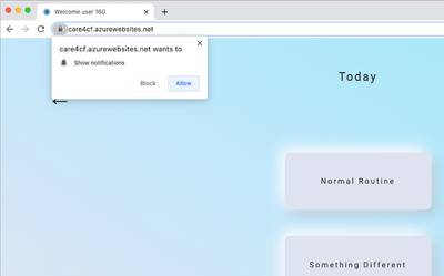
These subscription objects contain a URL, which acts as a browser-specific endpoint for the Push API. If accessing from Chrome, for example, it will contain a Google Firebase endpoint with a unique JWT contained in the URL, and if accessing from Firefox a similar endpoint is generated for Mozilla’s push service. The subscription objects also contain header information to access and authorise the API call, which is sent alongside the request.
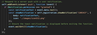
We also need to make sure the app is ready to actually display those notifications. I included an event listener for the ‘push’ event, which checks whether permission is granted, and if so, displays a notification with the given text and our app logo as an icon.
Now that the service worker has signed them up and the app knows how to display them, the user is ready to receive notifications on this device. First, we retrieve their subscription object from our database. We use the web-push package to issue the notification, passing that subscription object and a payload (i.e. the notification text) as arguments.

I used a CRON function to activate at a given time every day, automatically checking which users haven’t logged that day, retrieving their subscriptions and sending a reminder out to them. I also gave admins the ability to send custom notifications to all users, using a text input field to generate the content before passing it to the sendNotification function.

Optimising
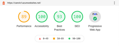
Finishing touches make all the difference. Chrome’s DevTools has a really useful section called Lighthouse, which gives your PWA various ratings out of 100 and guides you towards optimising even further. Following these steps makes sure the app performs well, is widely accessible, is visible to search engines and meets all the criteria necessary for a great PWA.
For example, I created a custom splash screen for the app. This is the brief loading screen you see when you open the app, and is created by setting the background colour and icon in the web manifest. I also made sure the icon is ‘maskable’, which means that the icon takes up all the space provided for it. Similarly, I edited the manifest and each page’s <head> to make sure the address bar is branded properly with the correct colour.
I made sure the app’s content is sized correctly for the window that’s viewing it. Devices come in all shapes and sizes so I wanted to be sure the content renders correctly and legibly. Search engines can rank pages based on how mobile-friendly they are, so I added a ‘viewport’ tag in each page’s <head> to make sure the width is scaled for the correct device.
When users download the app to their device’s home screen, we want our icon to be displayed. Android devices just use the image we specified in our manifest, but Apple devices are a little different. To make sure the app displays properly on the home screen of iOS devices, I added an ‘apple-touch-icon’ link to the <head> of each page.

Future Work
As with any project, there are things I’d do differently if I was to start again. I think that’s why tech is so addictive - you get stuck in an endless cycle of finishing one project and thinking “I’ll start my next project with what I know now”. However, a few main things jump to mind.
I hit an obstacle when trying to get those web push notifications to work on Apple products. It turns out that push notifications are currently unavailable via Safari without a paid Apple Developer’s License. Once we’ve done this and enabled notifications on the Safari browser, we’ll need an extra workaround to enable them on iOS devices like the iPhone or iPad. One of the examples I found involved using Apple’s PassKit to set up an Apple Wallet pass, and using that to generate native-like notifications whenever we need them. This will be something to consider once the trial’s research budget has been confirmed.
The app could also make greater use of the browser’s local storage to offer a faster experience. I dabbled with storing each user’s information locally and updating it whenever the user changes something, and although this was speedy, sometimes led to inconsistencies when logging from multiple devices. A better way might be to use local storage to display information promptly, sync the information to the database in the background, then refresh the local storage when the app is opened. I’m sure there are many more efficient ways to do this compared to how I built it, and given enough time I’d probably keep tinkering with it forever.
Finally, if I was starting again right from scratch, I would have used the pwa-starter resource from the PWABuilder team as my template. It gives everything you need for a proper, production-ready PWA and would have definitely saved me a lot of headache if I’d known about it from the offset. It even gets a perfect 100 score on Lighthouse.
Thanks For Reading!
This has been a fantastic project to work on. Building the app as a PWA was an efficient and practical solution to the brief, and also gave me a chance to become familiar with some of the most recent and exciting web capabilities. I’ve learned an incredible amount, and I’m truly proud to have created something that could help solve a problem to improve the quality of life for people with CF.
Posted at https://sl.advdat.com/3oElMMV