How would your organization benefit from better insights about future weather and traffic conditions? We’ve designed a workshop series to take you through the end to end process of using big data and machine learning to curate and visualize forecasts that can be used for scenarios like predicting hospital capacity, transportation trends, energy needs or financial risk. You’ll learn about using Azure Databricks, using fundamental workflows common to data scientists and data engineers for ingesting large data sets, exploring data, improving machine learning models, making predictions and visualizing your insights. In this three-part series, we’ll show deep dive technical demos while you can get your questions answered in real time. After each episode you’ll be able to get hands on to practice what we’ve shown you, and at the end you’ll have created a project that provides practical value.
Starting with a reliable data lake
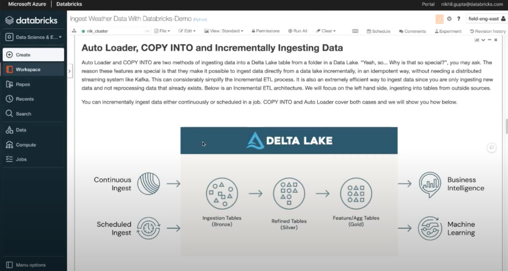
The first step in our journey is getting all the data into a common data source that can be used as a foundation for the project. For the first part of this series we’ll work with open weather and climate data from the NOAA that can be used for testing and analysis, and importantly, enhancing any data you yourself are interested in bringing to the project. We’ll go deep on Delta Lake, a file format that brings consistency to your data lake and has both open-source and managed offerings. Delta Lake is provided as a managed offering as part of your Azure Databricks account, and helps you combine the best capabilities of Data Lake, data warehousing, and a streaming ingestion system.
Exploring your data
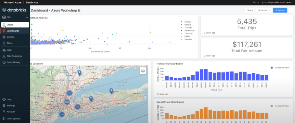
In part two of our series, we’ll cover how to perform exploratory analytics using SQL, including how to explore query results from different perspectives, understand the interesting attributes of your data, and track and monitor changes to incoming data. We’ll visually explore data, using a map to drill into aggregated geospatial data points from an Azure Open Dataset.
Create custom, interactive maps
To help you visualize the impact of weather on mission-critical functions, such as emergency room admissions, transportation challenges, or financial impacts of major events, we’ll use the machine learning capabilities of Azure Databricks and show you how to visualize results using Azure Maps Weather Services. We’ll walk you through the process of training a machine learning model, tuning hyperparameters, and selecting a model. Then we will learn how you can create a customized, interactive map to render and share your results.
Join us for the third live episode in this series to see Azure Databricks in action and get answers to your questions.
Posted at https://sl.advdat.com/2YFTcj5


