This article shows you how expose Azure Data Explorer (ADX) time series capabilities to Power BI. You will see how to pass parameters to an ADX function, using the powerfull make-series operator and linear interpolation of missing values in time series data. With this concept you could also expose more advanced functionalities, like time series anomaly detection.
If you have no experience yet with Power BI and Azure Data Explorer you should first finish the Visualize data in Power BI tutorial.
We present a solution which is built from these steps:
- Creating a table for a demo data-set and ingesting sample data (you can also make use of you own dataset. In this case your time series table should have at least three colums: A timestamp column (e. g. measurementDatetime), some device Identifier (e. g. deviceId), and a measurement value (e. g. temperature).
- Creating an ADX function, making use of some basic time series-capabilities that we want to expose to Power BI
- Creation of additional parameter tables
- The setup of the Power BI model and the report creation
1. Creating the time series data
If you want to make use of the available demo-dataset, you have to create a staging table raw and the transformation process to the target table measurement. The transformation will be done with a function doing the transformation and an update policy definition:
// raw table, where data is initially ingested
.create table raw (d : dynamic)

// ingestion mapping for the raw table
.create table raw ingestion json mapping "ingest-raw"' [{"column":"d","Properties":{"path":"$"}}]'

// measurement table
.create table measurement (deviceId:int, enqueuedTime:datetime, temperature:real)

// data transformation from the raw to the measurement table
.create-or-alter function
with (docstring = 'update policy for measurement', folder='PBI')
rawtransform()  {
raw
| extend m=todynamic(d.measurement)
| mv-expand (m)
| extend deviceId=tostring(m.header.deviceId), enqueuedTime=todatetime(m.header.enqueuedTime), temperature=toreal(m.temperature)
| project-away d, m}

// the update policy definition for the measurement table
.alter table measurement policy update [{"IsEnabled": true, "Source": "raw", "Query": "rawtransform()", "IsTransactional": false, "PropagateIngestionProperties": false}]'
Finally you upload the data from blob-storage to Azure Data Explorer:
// data ingest from Kusto sample data
.ingest into table raw ('https://kustosamplefiles.blob.core.windows.net/synapsework/complex.json') with '{"format":"json", "ingestionMappingReference":"ingest-raw"}'
2. Creating the ADX functions
You will query this table using the make-series operator, calculate the average, minimum, and maximum values on temperature and will do linear interpolation for missing values. We want the final chart to be flexible for the timeseries resolution (the bin size) and the number of datapoints. In this example you do a relative filtering always looking back from the last captured measurement data.
For this you need first to create a function that computes the maximum datetime value in the dataset (to get the last point of the time series):
// Function result is the maximum timestamp in table measurement
.create-or-alter function
with (docstring = "Function result is the maximum timestamp in table measurement", folder="PBI")
etime()
{
toscalar(measurement
| summarize etime=max(enqueuedTime))
}
Next, you will create a function for querying the measurement data. We pass as parameters:
- the number of datapoints the resulting dataset will have (we will limit it to 1,000 in the function) and
- the binsize, e. g. 1 minute or 1 hour (Note: For easier integration with Power BI we will define the datatype of the parameter as a string and convert it into a timespan datatype in the function.)
The starting point for the timeseries will be computed back from the last measurement timestamp (this is done with the function etime()). See the following chart, how the parameters in the make-series operator will be set:
The resulting function will look as follows:
.create-or-alter function
with (docstring = "Function returns a table with timeseries data.", folder="PBI")
measurementTS(_binsize:string = "1m" , _datapoints : int = 100) {
// convert the binsize passed as string to timespan, this will be used as a step in the timseries
let binsize = totimespan(toscalar(_binsize));
// the range, timespan to look back = number of bins * binsize, e. g. 100 minutes
let rng =  min_of (_datapoints - 1, 999) * binsize;
measurement
| make-series avg_temp=avg(temperature), max_temp=max(temperature), min_temp=min(temperature),
default=real(null) on enqueuedTime in range(etime() - rng, etime(), binsize) by deviceId
| project deviceId, dt=enqueuedTime , temp=series_fill_linear(avg_temp), maxtemp=series_fill_linear(max_temp), mintemp=series_fill_linear(min_temp)
| mvexpand dt, temp, maxtemp, mintemp
| project todatetime(dt), deviceId, avgtemp=toreal(temp), maxtemp=toreal(maxtemp), mintemp=toreal(mintemp)
}
You can test the function with the ADX in-build charting functionality:
measurementTS("1m", 20)
| where deviceId == 4
| project dt, avgtemp
| render timechart
So how can we use this Azure Data Explorer function in Power BI? We will make use of M-Query parameters. For this you must do some additional steps in Azure Data Explorer.
3. Creation of additional parameter tables
First, you will create two parameter tables, and fill them with default values:
(1) Create the parameter table for the binsize and fill it with default values:
// create the table for the binsize parameter
.create table binsize (bin_size:string, bin_order:int)

.set-or-replace binsize <|
   datatable(bin_size:string, bin_order:int)
   [
   "1s",  1,
   "10s", 2,
   "1m",  3,
   "1d",  4
   ]
(2) Create the parameter table for the number of datapoints and fill it with default values:
.create table datapoint (dp:int, dp_order:int)

.set-or-replace datapoint <|
   datatable(dp:int, dp_order:int)
   [
    1, 0,
    2, 1,
    5, 5,
    10, 10,
    60, 60,
    100,100,
    240, 240
   ]
The two tables are needed to have default filter values available in Power BI.
We are now prepared to visualize the time series data in Power BI.
4. Visualizing the parametrized data with Power BI
You will use the Azure Data Explorer native connector with DirectQuery mode in the scenario. For the visualization you make use of Dynamic M Query Parameters. As of writing this blog the functionality is still in preview, so make sure that this preview functionality is enabled (under options, preview features).
Now that you have prepared your data in Azure Data Explorer, you will do the modeling in Power BI Desktop with the following steps:
(1) In Power BI Desktop, on the Home tab, select Get Data and type Kusto in the search bar:
and connect to your cluster.
Important: select DirectQuery as data connectivity mode.
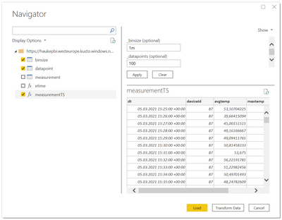
(2) You will import the tables binzsize, datapoint and the function measurementsTS. For the function you will see values, as previously defined default values for the parameters in the function in Azure Data Explorer:
(3) Create the parameters
Now you can create the parameters to be passed to the function. Go to the Power Query editor and create a new parameter for the binsize. Select Text for the type (we are doing the transformation to the timespan datatype in the Azure Data Explorer function):
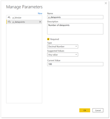
(4) Create the second parameter for the number of datapoints to be visualized. Important: choose decimal number as the datatype:
(5) Now you can configure the parameters to be passed to the function (Important: Under view the Formular Bar option must be checked). Replace the default values with the parameters p_binsize and p_datapoints:
(6) Bind the parameters to the parameter tables:
Finally, you bind the two parameters to the parameter table. Close the Power Query Editor, to switch back to the model view and configure under advanced options (in the column properties) the parameter binding for the two columns. Start with table binsize. Also change the Sort by column to bin_order and hide the bin_order column:
Do the same steps for the dp column in the table datapoint:
With this we are done with the modeling part and can create a report on the model.
(7) Create the report
Select a line chart as a visualization. Define bin_size, dp and deviceId as filters. For dp set basic filtering. Filter on 1m, 10 datapoints and select 4 DeviceIDs. Add dt to the axis of the visual, deviceId to Small multiple and avgtemp, maxtemp, mintemp to Values.
The resulting report should look like:
Conclusion
We have seen how we can make use of the ADX powerful time series capabilities in Power BI, passing parameters to an ADX function and with the dynamic M Query parameter, exposing the function resultset to Power BI.
Posted at https://sl.advdat.com/3v84nxc


