ADX dashboards November 2021 updates
Slice and dice
Cross filtering
We’re happy to announce the first release of a new cross filter capability to easily filter dashboard pages by interacting with the visual data points.
Cross filter is defined per visual and serves as a new way to interact with the dashboard by selecting data points in a tile and assigning the data point value to a dashboard filter in the current dashboard page.
It is achieving the same outcome as entering a value in a dashboard page filter, but in a more intuitive way as part of ad-hoc exploration of the dashboard data.
Cross filter is supported for all visual types and allows defining a single interaction and cross filter per visual.
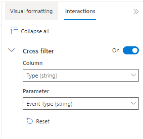
To create a cross filter, enter tile editing screen and open the “Interactions” tab in the visual formatting right pane.
You need to configure a pair of a column (that provides the value) and a parameter (it feeds). Make sure the column and the parameter selected are of the same data type.
Now you’re all set to interactively explore your dashboard, filtering the data intuitively and efficiently.
Page level filters
It is now possible to set filters to specific pages and not only in the dashboard level.
This means you can create a set of parameters in the scope of the dashboard and decide where to use each one of them. Some you can totally disable in the dashboard, others you can use as filters in the scope of the entire dashboard and a third group of parameters can be used as filters only in specific dashboard pages.
Use the “Show on pages” control to specify where to use the filters.
Control filter ordering
Many of you have been asking for better control of filter ordering in dashboards.
Now you achieve this by using the “Move to” option on the parameters right pane or by simply dragging and dropping the parameter card.
Visualizations
Map visual updates
You’ve been asking us to get more out of the map visual and we have been listening.
With the new map visual, it is not required anymore, to provide a strict 4 columns result-set structure.
You can use any result set and flexibly select how to provide the location data. You can use either a point column or a pair of latitude and longitude columns.
It is now possible also to dynamically set the bubble size using the data in the result set. Select a numeric column to define the size.
ADX dashboards team is looking forward for your feedback in KustoWebExpFeedback@service.microsoft.com
You’re also welcome to add more ideas and vote for them here - https://aka.ms/adx.ideas
ADX dashboards team
Posted at https://sl.advdat.com/3DaAEXw


