Website: ResponsibleAIToolbox.ai
Github repository: https://github.com/microsoft/responsible-ai-toolbox
Learn more about Azure responsible AI event and the new resource for product leaders: https://aka.ms/RAIEventHeroBlog
Mehrnoosh Sameki, Senior Program Manager
Besmira Nushi, Principal Researcher
AI is expected to contribute nearly $16 trillion to the global economy by 2030. There are, however, growing concerns about the ethical risks associated with AI systems. Companies acknowledge the need and benefits of operationalizing Responsible AI principles to guide their processes and actions. The big challenge, however, lies in execution; while Responsible AI is about rigorous engineering, its operationalization is tedious, manual, and time-consuming without the right tooling and infrastructure. There are minimal instructions, and few disjointed frameworks and tools available to empower data scientists explore and evaluate their models holistically. Moreover, to truly enable responsible use of AI, one require a whole new world of tools, best practices, and examples to inform their responsible data-driven decision making processes.
While progress has been made on individual tools for specific areas of Responsible AI, data scientists often need to use a variety of such tools together, to holistically evaluate their models and data. For example, if a data scientist discovers a fairness issue with one tool, they then need to jump to a completely different tool to understand what data or model factors lie at the root of the issue before taking any steps on mitigation. This highly challenging process is further complicated be the following reasons. First, there is no central location to discover and learn about the tools, extending the time it takes to research and learn new techniques. Second, the different tools do not exactly communicate with each other. Data scientists must wrangle the datasets, models, and other metadata as they pass them between the different tools. Third, the metrics and visualizations are not easily comparable, and the results are hard to share.
To address the above challenges and make it easier and more efficient for data scientists to operationalize Responsible AI, we are introducing the Responsible AI dashboard, a single pane of glass bringing together several mature Responsible AI tools in the areas of machine learning interpretability, unfairness assessment and mitigation, error analysis, causal inference, and counterfactual analysis for a holistic assessment and debugging of models and making informed business decisions. The dashboard addresses the tool discoverability and fragmentation issues by enabling you to:
- [Model Debugging] Evaluate machine learning models by identifying model errors, diagnosing why those errors are happening, and mitigating them.
- [Responsible Decision Making] Boost your data-driven decision-making abilities by addressing questions such as “what is the minimum change the end user could apply to his/her features to get a different outcome from the model?” and/or “what is the causal effect of reducing red meat consumption on diabetes progression?”
Figure 1 – Responsible AI dashboard components for model debugging and responsible decision making
Let’s now take a closer look at each area and see how the Responsible AI dashboard assists you to tackle these tasks faster and more efficiently.
Model Debugging
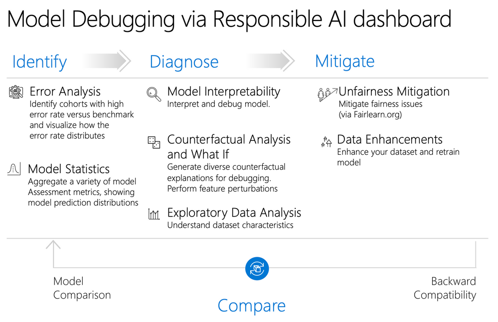
Assessing and debugging machine learning models is critical for Responsible AI. It helps determine how and why AI systems behave the way they do. Data scientists can then use this knowledge to improve model performance. Conceptually, model debugging consists of three stages:
- Identify, to understand and recognize model errors by addressing the following questions:
- What kinds of errors does my model have?
- In what areas are errors most prevalent?
- Diagnose, to explore the reasons behind the identified errors by addressing:
- What are the causes of these errors?
- Where should I focus my resources to improve my model?
- Mitigate, to use the identification and diagnosis insights from previous stages to take targeted mitigation steps and address questions such as:
- How can I improve my model?
- What social or technical solutions exist for these issues?
Figure 2 – Responsible AI dashboard capabilities for debugging machine learning models. The capabilities can assist you in two specific stages of error identification and diagnosis so that you can take informed error mitigation decisions.
Here are the components of the Responsible AI dashboard supporting model debugging. Mitigation steps are available via stand-alone tools such as Fairlearn (for unfairness mitigation), and will be integrated in to the dashboard workflows in future updates.
|
Identify errors |
Error Analysis The Error Analysis component provides machine learning practitioners with a deeper understanding of model failure distribution and assists them with quickly identifying erroneous cohorts of data. The capabilities of this component in the dashboard are founded by Error Analysis capabilities on generating model error profiles. |
|
Identify errors |
Model Statistics The Model Statistics component aggregates a variety of model assessment metrics, showing a high-level view of model prediction distribution for better investigation of its performance. |
|
Diagnose errors |
Data Explorer The Data Explorer component helps to visualize datasets based on predicted and actual outcomes, error groups, and specific features. This helps to identify issues of over- and underrepresentation and to see how data is generally clustered in the dataset. |
|
Diagnose errors |
Model Interpretability The Interpretability component generates human-understandable explanations of the predictions of a machine learning model. It provides multiple views into a model’s behavior: global explanations (e.g., which features affect the overall behavior of a loan allocation model) and local explanations (e.g., why an applicant’s loan application was approved or rejected). The capabilities of this component in the dashboard are founded by InterpretML capabilities on generating model explanations. |
|
Diagnose errors |
Counterfactual Analysis and What-If The Counterfactual Analysis and what-if component consists of two functionalities for better error diagnosis:
The capabilities of this component in the dashboard are founded by the DiCE package, which provides this information by showing feature-perturbed versions of the same datapoint which would have received a different model prediction (e.g., Taylor would have received the loan approval prediction if his/her yearly income was higher by $10,000). |
Responsible Decision-making
Decision-making is one of the biggest promises of machine learning. The Responsible AI dashboard helps you inform your model-driven and data-driven business decisions.
- Data-driven insights to further understand heterogeneous treatment effects on an outcome, using historic data only. For example, “how would a medicine impact a patient’s blood pressure?". Such insights are provided through the "Causal Inference" component of the dashboard.
- Model-driven insights, to answer end-users’ questions such as “what can I do to get a different outcome from your AI next time?” to inform their actions. Such insights are provided to data scientists through the "Counterfactual Analysis and What-If" component described above.
Figure 3 – Responsible AI dashboard capabilities for responsible business decision making. The exploratory data analysis, counterfactual analysis, and causal inference capabilities can assist you make informed model-driven and data-driven decisions responsibly.
Here are the relevant components of the dashboard supporting responsible decision making:
|
Inform your decisions |
Data Explorer The component could be reused here to understand data distributions and identify over- and underrepresentation. Data exploration is a critical part of decision making as one can conclude that it is not feasible to make informed decisions about a cohort that is underrepresented within data. |
|
Inform your decisions |
Causal Inference The Causal Inference component estimates how a real-world outcome changes in the presence of an intervention. It also helps to construct promising interventions by simulating different feature responses to various interventions and creating rules to determine which population cohorts would benefit from a particular intervention. Collectively, these functionalities allow you to apply new policies and affect real-world change. The capabilities of this component are founded by EconML package, which estimates heterogeneous treatment effects from observational data via machine learning. |
|
Inform your decisions |
Counterfactual Analysis The Counterfactual Analysis component described above could be reused here to help data scientists generate a set of similar datapoints with opposite prediction outcomes (i.e. showing minimum changes applied to a datapoint's features leading to opposite model predictions). Providing counterfactual examples to the end users inform their perspective, educating them on how they can take action to get the desired outcome from the model in the future. The capabilities of this component are founded by DiCE package. |
The Responsible AI dashboard is developed in the Responsible-AI-Toolbox GitHub repository. To install the Responsible AI Toolbox’s “raiwidgets” package, in your python environment simply run:
pip install raiwidgets
pip install --upgrade pandas
Alternatively, you can also clone the open-source repository and build the code from scratch:
git clone https://github.com/microsoft/responsible-ai-toolbox.gitYou will need to install yarn and node to build the visualization code, and then you can run:
yarn install
yarn buildall
And install from the raiwidgets folder locally:
cd raiwidgets
pip install –e .
For more information see the contributing guide.
If you intend to run repository tests, in the raiwidgets folder of the repository run:
pip install -r requirements.txtGetting started: model debugging
This post illustrates the Responsible AI dashboard by using a binary classification task on housing price prediction (price > median , price < median). The model under inspection will be trained on Kaggle’s tabular housing price dataset, which contains both numerical and categorical features such as TotalBsmtSF (total area of the basement in square feet), GrLivArea (above ground living area), GarageArea (size of garage in square feet), LotFrontage (linear feet of street connected to property), Fireplaces (Number of fireplaces), etc.
Imagine we want to use this model to provide house sellers with advice on how best to price their houses in the market. Of course, we would like to avoid underestimating the actual price as an inaccurate price could impact sellers’ profits, and their ability to access finance from a bank. We can call the Responsible AI dashboard using the API below, which first creates a RAIInsights object by taking in the model or pipeline, train and test datasets, the corresponding labels (true_y parameter), problem type (e.g., classification), and categorical features:
# In case of feature transformations:
dashboard_pipeline = Pipeline(steps=[('preprocess', feat_pipe), ('model', model)])
rai_insights = RAIInsights(dashboard_pipeline, train_data, test_data, target_feature, 'classification', categorical_features=categorical_features, train_labels=['Less than median', 'More than median'])

# In case of no feature transformations:
rai_insights = RAIInsights(model, train_data, test_data, target_feature, 'classification', categorical_features=categorical_features, train_labels=['Less than median', 'More than median'])
Feature transformations are useful when the model itself may operate on transformed features (e.g. numerical transformations or encodings) but the analysis results and visualizations are best understood when shown in terms of the original features. For example, for this dataset, we’d like to see feature predicates such as “GarageArea < 800” rather than “GarageArea < 0.3” (assuming 0.3 is the normalized value of 800 sqft).
For larger datasets, we can downsample the data to fewer rows and then pass that to the RAIInsights object:
test_data_sample = test_data.sample(n=500, random_state=5)
train_data_sample = train_data.sample(n=8000, random_state=5)

rai_insights = RAIInsights(model, train_data_sample, test_data_sample, target_feature, 'classification', categorical_features=categorical_features)
Next, we customize the dashboard by adding desired components to the rai_insights object. We explicitly activate error analysis, model interpretability, and counterfactual analysis and what-if components. Please note that the model statistics and data explorer components do not require activation and are enabled by default.
# Add model error analysis for identification
rai_insights.error_analysis.add()

# Add model interpretability for diagnosis
rai_insights.explainer.add()

# Generate 10 counterfactuals for each datapoint, leading to opposite class predictions
rai_insights.counterfactual.add(10, desired_class='opposite')
Next, we compute insights and pass them to the Responsible AI dashboard.
# Compute insights
rai_insights.compute()

# Load the Responsible AI dashboard
ResponsibleAIDashboard(rai_insights)
All screenshots below are generated using a LGBMClassifier with five estimators. You can directly run this example using this Jupyter notebook in our repository.
Model Debugging Flow
1. Identification
The dashboard starts with the Error Analysis capabilities on top, for identifying cohorts of data with a higher error rate versus the overall benchmark error rate. The dashboard allows for error exploration by using either a decision tree guided by errors or an error heatmap.
Decision Tree for Error Identification
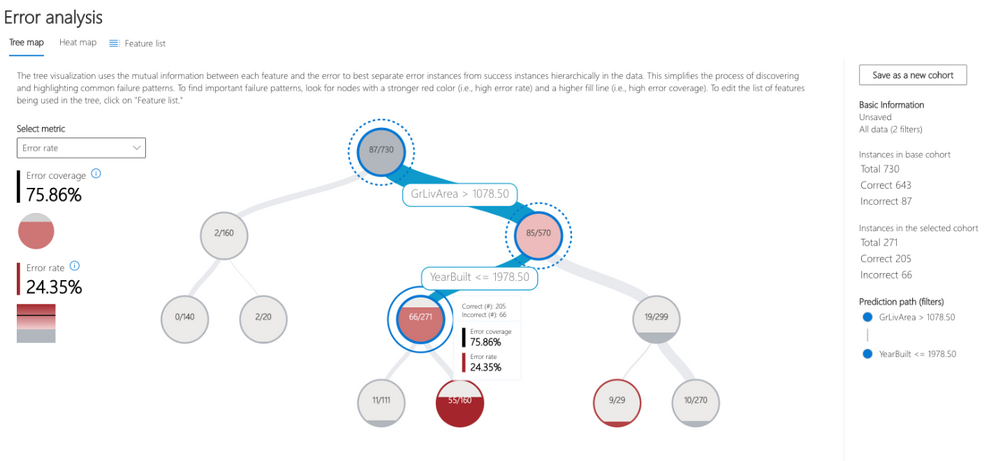
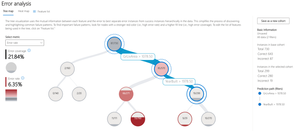
Very often, error patterns may be complex and involve more than one or two features. Therefore, it may be difficult for developers to explore all possible combinations of features to discover hidden data pockets with critical failure. To alleviate the burden, the tree visualization automatically partitions the benchmark data into interpretable subgroups, which have unexpectedly high or low error rates. In other words, the tree leverages the input features to maximally separate model error from success. For each node defining a data cohort (e.g. “apartments that were built before 1980 that have at least one fireplace”), users can investigate the following information:
- Error rate - portion of instances in the node for which the model is incorrect. This is shown through the intensity of the red color.
- Error coverage – portion of all errors that fall into the node. This is shown through the fill rate of the node.
- Data representation - number of instances in the node. This is shown through the thickness of the incoming edge to the node along with the actual total number of instances in the node.
Figure 4 – Decision tree that aims at finding failure modes by separating error instances from success instances in the data. The hierarchical error pattern here shows that while the overall error rate is 11.92% for the dataset, top) it can be as high as 24.35% for large old houses. Bottom) In contrast, large and new houses have a much lower error rate of 6.35%.
Error Heatmap for Error Identification
The view slices the data based on a one- or two-dimensional grid of input features. Users can choose the input features of interest for analysis. The heatmap visualizes cells with higher error with a darker red color to bring the user’s attention to regions with high error discrepancy. This is beneficial especially when the error themes are different in different partitions, which happens frequently in practice. In this error identification view, the analysis is highly guided by the users and their knowledge or hypotheses of what features might be most important for understanding failure.
Cohort definition and manipulation
To specialize the analysis and allow for deep dives, both error identification views can be generated for any data cohort and not only for the whole benchmark. Cohorts are subgroups of data that the user may choose to save for later use if they wish to come back to those cohorts for future investigation. They can be defined and manipulated interactively either from the heatmap or the tree. They can also be carried over to the next diagnostical components on data exploration and model explanations.

Understanding model predictions
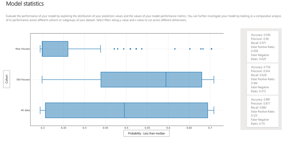
Model Statistics Users can see a high-level view of model predictions distributions across different cohorts of data, inspect the model by looking at a variety of performance metrics that can further help characterize errors more specifically (e.g., to distinguish between false positives and negatives in binary classification). This nuance builds intuition for next steps in model debugging.
Figure 6- In figure 4, we discovered that for older houses with large above ground living area, the model has higher failure rates. When we look at how model predictions are distributed across older houses (higher error) cohort, newer houses cohort, and all-data cohort, we observe that according to the model older houses have a higher probability of selling for less than median. At the same time, the panel on the side shows that for older houses the false negative rate is higher than for the newer houses (0.372 vs. 0.029). In combination with the fact that error analysis revealed a higher error rate in general for older houses, we can conclude that most model errors for older houses can be attributed to price underestimation.
2. Diagnosis
After identifying cohorts with higher error rates, the Responsible AI dashboard enables debugging and exploring these cohorts further. It is then possible to gain deeper insights about the model or the data through data exploration, model interpretability, and counterfactual analysis.
Debugging the data
Data Explorer: Users can explore dataset statistics and distributions by selecting different features and estimators along the two axes of the data explorer. They can further compare the cohort data stats with other cohorts or the overall benchmark data. This view can for instance uncover if certain cohorts are underrepresented or if their feature distribution is significantly different from the overall data, hinting therefore to the potential existence of outliers or unusual covariate shift.
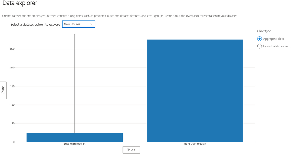
Figure 7 - In figure 4, we discovered that for older houses with large above ground living area, the model has higher failure rates. When we look at how the data is distributed across the “ground truth” we can see that (top) there are fewer older houses selling more than the median price. This is in contrast with newer houses (bottom) which in general have a lot cases selling more than median. Given that the ground truth distribution is also a lot more skewed for newer houses, this demonstrates that it is easier for the model to make a correct prediction by just always predicting “More than median”, as observed in figure 6. On the other hand, for older houses there is not enough data representing expensive old houses. One possible action is to collect more of this data and retrain the model.
Debugging the model
Model interpretability is a powerful means for extracting knowledge on how a model works. To extract this knowledge, Responsible AI dashboard relies on Microsoft’s InterpretML dashboard and library.
Global explanations
Feature Importance: Users can explore the top K important features that impact the overall model predictions (a.k.a. global explanation) for a selected subgroup of data or cohort. They can also compare feature importance values for different cohorts side by side. The information on feature importance or the ordering is useful for understanding whether the model is leveraging features that are necessary for the prediction or whether it is relying on spurious correlations, or whether the model is potentially misusing fairness-sensitive attributes. By contrasting explanations that are specific to the cohort with those for the whole benchmark, it is possible to understand whether the model behaves differently or in an unusual way for the selected cohort. If this is the case, and if that cohort is defined via fairness-sensitive attributes this may flag potential fairness concerns with the model.
Dependence Plot: Users can see the relationship between the values of the selected feature to its corresponding feature importance values. This visualizes how values of the selected feature impact model prediction.
Figure 8 - Global feature explanations for the housing price class prediction model show that overall finish quality, above ground living area, and total basement square footage are the most important features globally. By clicking on each feature, it is possible to observe more granular dependencies. For example, clicking on overall finish quality reveals that a lower finish quality impacts the price prediction negatively.
Local explanations
Global explanations approximate the overall model behavior. For focusing the debugging process on a given data instance, users can select any individual data points (with correct or incorrect predictions) from the tabular instance view to explore their local feature importance values (local explanation) and individual conditional expectation (ICE) plots.
Local Feature Importance: Users can investigate the top K (configurable K) important features for an individual prediction. Helps illustrate the local behavior of the underlying model on a specific data point.
Individual Conditional Expectation (ICE): Users can investigate how changing a feature value from a minimum value to a maximum value impacts the prediction on the selected data instance.
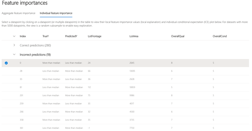
Figure 9 - For this house, the model outputs a wrong prediction, predicting that the house will sell for less than median price, while the opposite is true. We can observe the top important features impact this wrong model prediction.
Instance views: Beyond data statistics, sometimes it is useful to merely just observe the raw data along with labels in a tabular form. Instance views provide this functionality and divide the instances into correct and incorrect tabs. By eyeballing the data, the developer can identify potential issues related to missing features or label noise.
Perturbation Exploration (what-if analysis)
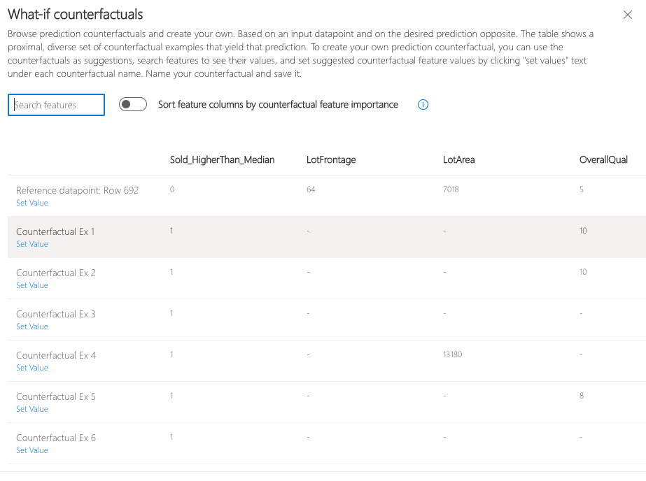
Counterfactual Examples: Users can browse prediction counterfactuals and create their own free-form what-if scenarios. Based on an input datapoint and on the desired prediction opposite. The table shows a proximal, diverse set of counterfactual examples that yield that prediction. Such a set may be useful when this part of the dashboard is used to recommend potential actions towards a desirable prediction (e.g. “What minimal changes in the house would flip the model prediction if that model is used in a property appraisal pipeline”).
In other cases, data scientists may need to create their own prediction counterfactual. To do so, first use the counterfactuals as suggestions, search features to see their values, and set suggested counterfactual feature values by clicking "set values" text under each counterfactual name. Name your counterfactual for future reference and save it. This type of instance debugging and investigation may be useful when the model seems to have several important but correlated features, but it is unclear whether changing only one of them would be sufficient for flipping the model prediction or whether an intervention on all features is necessary.
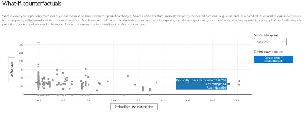
Figure 10 - With what-if explanations, it is possible to understand how the model would behave if one of the feature values changes. For instance, here we can see that for house index 692 which has a high prediction probability of selling for less than median, if the house had a higher overall finish quality of 10 (overall finish quality changed from 5 to 10) the model would have made the opposite prediction. While in the real world many of these features are not mutable, this sensitivity analysis is intended to further support practitioners with model understanding capabilities.
Getting started: Responsible Decision Making
Decision-making capabilities in the Responsible AI dashboard are intended to support customers and data scientists in the process of better understanding decisional data and taking actions for desirable outcomes. For example, in the housing prices domain, house owners and builders may be interested in getting guidance as to what to improve in their houses to get a better price ask in the market. Next, we show how to historical data and causal inference to provide such guidance. Note that this analysis is fundamentally different from traditional correlational analysis on data, as it provides actionable guidance and prevents users from taking conclusions based on coincidental but non-causal relationships in the data.
To activate causal insights in the dashboard, the first step is to pass treatments of interest alongside the actual housing prices to estimate the impact of those treatments on the market price. Note that you can pass “None” as your model object as this component only uses historical data. As an example, below we pass overall condition, overall finish quality, number of fireplaces, number of garage cars, and screen porch square footage as treatments to inform sellers about what to improve to see a boost in their market sales:
rai_insights = RAIInsights(None, train_data, test_data, target_feature, 'regression', categorical_features=categorical_features)

rai_insights.causal.add(treatment_features=['OverallCond', 'OverallQual', 'Fireplaces', 'GarageCars', 'ScreenPorch'])

# Compute insights
rai_insights.compute()

# Load the dashboard
ResponsibleAIDashboard(rai_insights)
You can directly run this example using this Jupyter notebook.
Responsible Decision Making Flow
Upon loading the dashboard with the causal inference component, there are three sets of functionalities that could help:
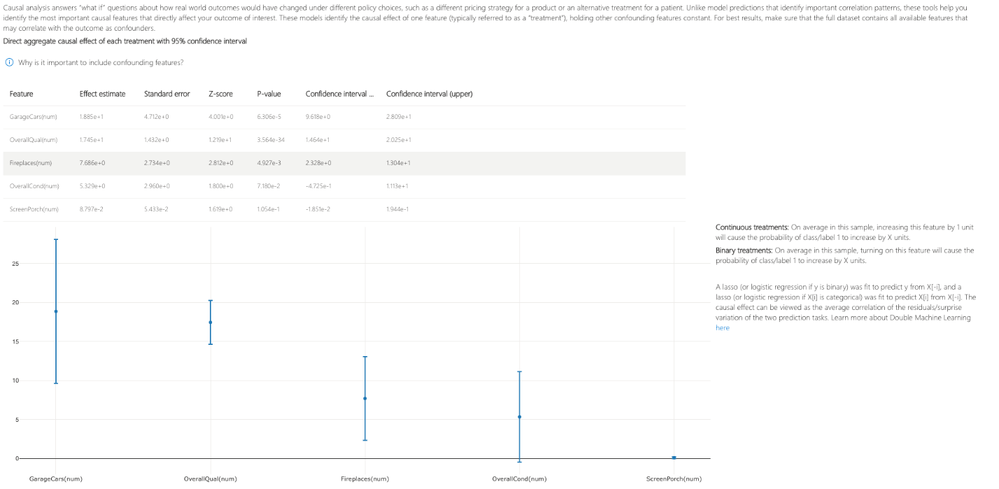
Aggregate causal effects: Causal analysis answers real-world “what if” questions about how an outcome would have changed under different policy choices. In this particular example, it demonstrates how changing a particular treatment (such as building more garages or fireplaces) would impact the average house prices in this dataset.
Figure 11 - With aggregate causal effects, you can see on average in the dataset, how increasing a feature by 1 unit (for continuous treatments) or turning on a feature (for binary treatments) would impact the housing price in $1,000 units. All values are reported with 95% confidence intervals.
Treatment policy: Imagine you want to provide insights to a real-estate developer who owns a lot of houses to inform them what improvements they could apply to increase their overall market sales. Treatment policies represent the best future interventions they can apply to their houses to see the biggest positive boost in their housing prices.
Figure 12 – Using the treatment policy tab, it becomes clear that for some houses with lower overall condition and bigger enclosed porch and for some other houses with higher overall condition and smaller open porch square footage, one is recommended to remove the screen porch. In contrast, for the other houses not falling into one of these categories, the treatment policy suggests the seller to expand the screen porch.
Individual causal what-if: Finally, users can also leverage individual causal effects to understand the impact of different treatments for a specific home. This is a great feature to provide insights to a specific house owner (e.g., if you increase the number of fireplaces of your house by 1 unit, that impacts your housing price by 16K). You can further perform causal what-if to understand how perturbing a treatment would impact the actual outcome.
Figure 13 – Using the individual causal what-if, one can observe a specific house (e.g., house index 31) and see how different treatments would impact that house's price. In this example, increasing the number of garages by 1 unit would have a positive impact of 39.596K on this housing price. Moreover, you can perform causal what if analysis to explore the impact of different treatment values on real-world outcomes.
Conclusion
To conclude, we introduce the Responsible AI dashboard, a single pane of glass for debugging machine learning models and for informing effective data-driven decisions. As machine learning and data science become an integral part of high-stake applications in healthcare and finance, these investigations ensure that AI technologies are developed responsibly and in a trustworthy manner. While the Responsible AI approach requires a larger sociotechnical lens for addressing long-term societal effects of AI, we hope that this tool integration effort can accelerate the process of drawing insights to inform diverse teams which can then translate such insights into actions that best impact people’s lives.
Learn more about the RAI dashboard on responsibleaitoolbox.ai and use it in your machine learning lifecycle to boost justified trust and appropriate reliance in your AI-driven processes.
Acknowledgements
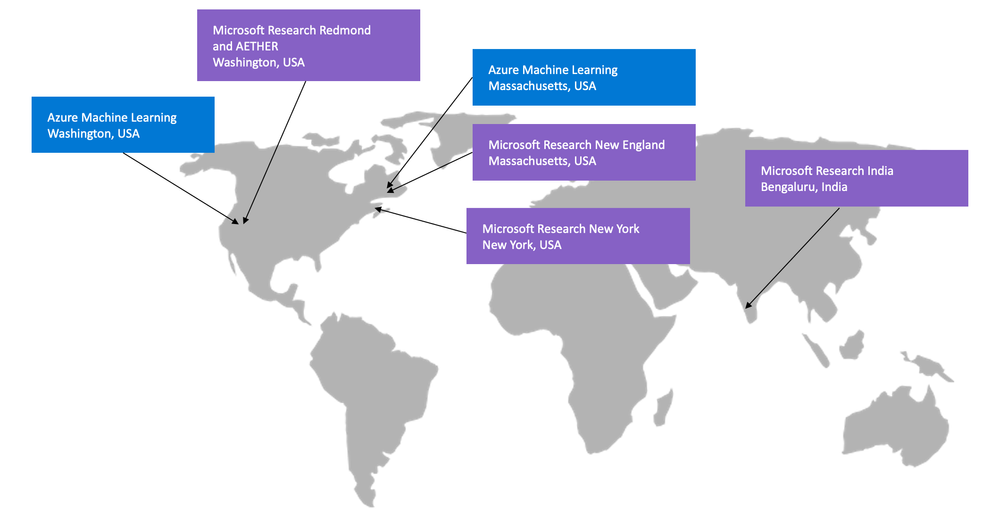
In the past year, our teams across the globe have joined forces to release the very first one-stop-shop dashboard for easy implementation of responsible AI in practice, making these efforts available to the community as open source and as part of the Azure Machine Learning ecosystem. We acknowledge their great efforts and are excited to see how you use this tool in your AI lifecycle.
Microsoft Research:
- Responsible AI dashboard: Besmira Nushi (Research Lead)
- Causal Inference: Vasilis Syrgkanis, Eleanor Dillon, Keith Battocchi, Paul Oka, Greg Lewis, Emre Kiciman, Friederike Niedtner
- Error Analysis and Interpretability: Ece Kamar, Besmira Nushi, Saleema Amershi, Eric Horvitz, Rich Caruana, Paul Koch, Harsha Nori, Samuel Jenkins, Rahee Gosh Peshawaria
- Counterfactual Analysis: Amit Sharma
- AI Fairness: Hanna Wallach, Miro Dudik
- AI Ethics and Effects in Engineering and Research (Aether): Eric Horvitz, Xavier Fernandes, Mihaela Vorvoreanu, Kathleen Walker, Sarah McGee, Dean Carignan
Azure Machine Learning:
- Responsible AI Engineering: Vijay Aski, Kin Chan, Richard Edgar, Gaurav Gupta, Vinutha Karanth, Rachel Kellam, Dawei Li, Roman Lutz, Ilya Matiach, Mehrnoosh Sameki, Anup Shirgaonkar, Steve Sweetman, Lan Tang, Minsoo Thigpen, Ke Xu, Tong Yu, Bo Zhang, Ruby Zhu
- Summer Intern: Vyoma Raman
- Marketing: Thuy Nguyen, Prem Prakash, Sonal Pardeshi, Nishant Thacker
Big thanks to everyone who made this possible!
Posted at https://sl.advdat.com/3lIpv9A
