Comparative Analysis by different values in same dimension in Power BI
Have you ever wanted to compare metrics between 2 sets of selected values in the same dimension in a Power BI report? For example, let’s say you wanted to compare claims metrics of one hospital or a group of hospitals to another hospital or group of hospitals, with the ability to slice on which hospitals to use on each side of the comparison vs doing some type of segmentation based upon metrics or creating additional hierarchies or groupings in the dataset. In this article I will outline a technique for doing so which overcomes the inherent filter context of a traditional star schema as well as not requiring dataset changes whenever you want to group by different dimension values. To illustrate this solution, I used the AdventureWorksDW Database as the data source. I will first take you through creating the DAX calculations and tables needed so end user can compare a single measure, Reseller Sales Amount, between different Sale Region groups. We will later extend the solution to support additional measures between different Sales Regions.
Compare a single measure to different regions
Below are the steps to compare the measure Reseller Sales Amount between different Sales Regions sets. We need 2 copies of the table containing Sales Region and 2 measures to return the Reseller Sales Amount for each Sales Region filter.
- Create the 2 reference tables
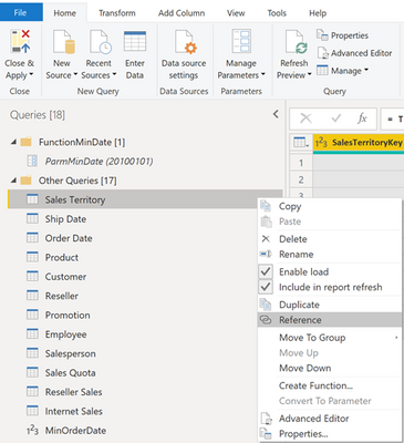
- In the Power Query Editor, right click on the table which contains the entity values to compare and select Reference.
- Rename the table as desired.
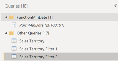
- Create the 2nd table, repeating steps 1a and 1b above. There are now 3 identical tables.
- In the two new tables, optionally remove any columns not needed for filtering.
- Click Close and Apply to exit Power Query.
- In the Power Query Editor, right click on the table which contains the entity values to compare and select Reference.
- Ensure new tables do not have relationships to other tables
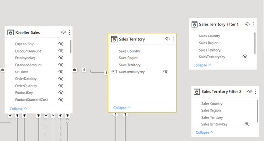
- In the Data Modeling tab in Power BI, ensure that the new filter tables do not have any relationships to any other tables. If relationships were automatically created to these tables, delete them. Only the original dimension table should have a relationship to the fact table.
- In the Data Modeling tab in Power BI, ensure that the new filter tables do not have any relationships to any other tables. If relationships were automatically created to these tables, delete them. Only the original dimension table should have a relationship to the fact table.
- Create the measures for returning the Reseller Sales Amount for selected regions
- Using the DAX CALCULATE function and the TREATAS table expression, add 2 new measures that will return Reseller Sales Amount for the selected Sales Regions:
Selected Sales Region 1 = CALCULATE ( [Reseller Sales Amount], TREATAS ( VALUES ( 'Sales Territory Filter 1'[Sales Region] ), 'Sales Territory'[Sales Region] ) ) Selected Sales Region 2 = CALCULATE ( [Reseller Sales Amount], TREATAS ( VALUES ( 'Sales Territory Filter 2'[Sales Region] ), 'Sales Territory'[Sales Region] ) ) - Create other measures as desired based upon the new measures created in step 3a:
Var Sales Region 1 Vs 2 = [Selected Sales Region 1] - [Selected Sales Region 2]Var% Sales Region 1 = DIVIDE([Var Sales Region 1 Vs 2],[Selected Sales Region 1]) - Create other measures to use in cards and titles to show which filter values were selected for comparisons:
Region 1 Selection = CONCATENATEX (
    ALLSELECTED ( 'Sales Territory Filter 1'[Sales Region] ),
    'Sales Territory Filter 1'[Sales Region],
    ", "
)
Region 2 Selection = CONCATENATEX ( ALLSELECTED ( 'Sales Territory Filter 2'[Sales Region] ), 'Sales Territory Filter 2'[Sales Region], ", " )Region 1 vs 2 = [Region 1 Selection] & " vs. " & [Region 2 Selection]Reseller Sales Amount Region Label = "Reseller Sales Amount, " & [Region 1 vs 2]
- Using the DAX CALCULATE function and the TREATAS table expression, add 2 new measures that will return Reseller Sales Amount for the selected Sales Regions:
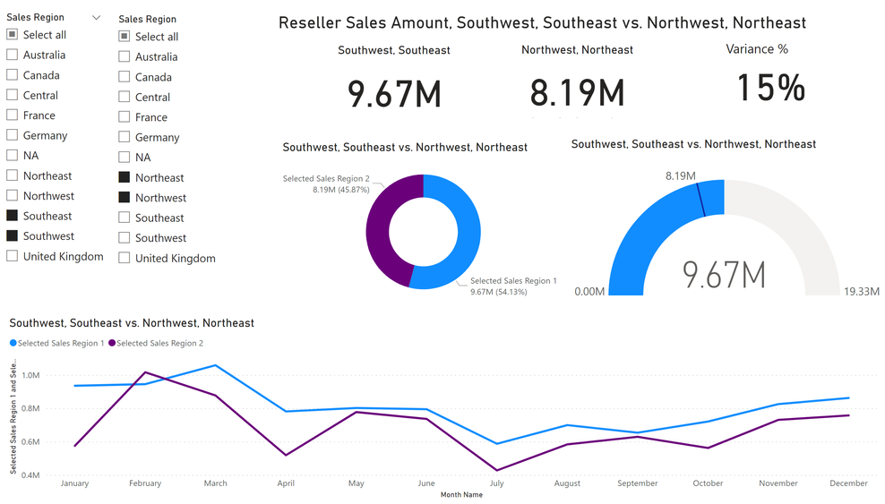
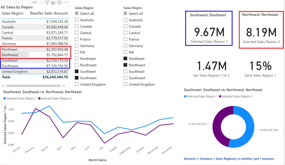
Below is a Power BI report showing slicers for the 2 new disconnected Sales Region tables comparing Southeast and Southwest vs Northeast and Northwest. For testing, I included the Sales Region table with relationship to the fact table which shows that the totals for Southeast and Southwest and for Northwest and Northeast match the Selected Sales Region 1 and Selected Sales Region 2 measure totals.
Enhance to allow selection of different measures to compare between regions
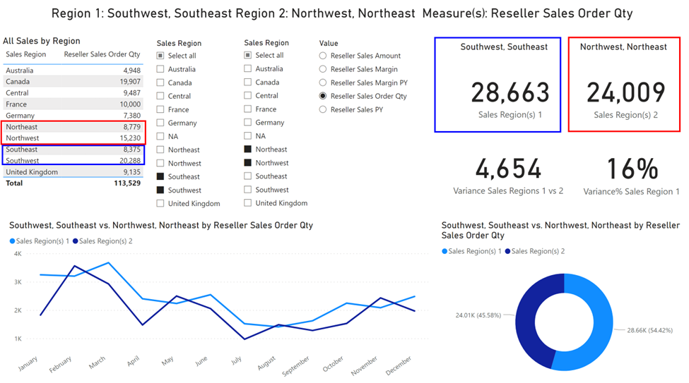
If the end user is only interested in comparing 1 measure between different dimension values, the work is done! However, if they want to compare using multiple measures, you can create a “measures dimension” to filter which measure to display in your visualizations. I originally tried creating the measures dimension using a calculation group, but filtering using the disconnected region tables did not work as expected over the calculation group items. Hence, I relied on another technique of creating a table containing the names of existing measures to filter on followed by creating the DAX calculated measures to return the result of the selected measure and sales regions.
- Create the measure table
- Since this is a very small table and I wanted little overhead to update the values for demo purposes, I create the measure table as a DAX calculated table, loaded with some of the existing measure names to choose from:
Switch Measures = {"Reseller Sales Amount","Reseller Sales Margin", "Reseller Sales PY", "Reseller Sales Margin PY","Reseller Sales Order Qty"}- This creates a table called Switch Measures, with a default column name of Value
- Since this is a very small table and I wanted little overhead to update the values for demo purposes, I create the measure table as a DAX calculated table, loaded with some of the existing measure names to choose from:
- Create the measures
- Create the measure to return the selected measure leveraging the HASONEFILTER and SWITCH functions:
Switch Value = IF ( HASONEFILTER ( 'Switch Measures'[Value] ), SWITCH ( SELECTEDVALUE ( 'Switch Measures'[Value] ), "Reseller Sales Amount", [Reseller Sales Amount], "Reseller Sales Margin", [Reseller Sales Margin], "Reseller Sales PY", [Reseller Sales PY], "Reseller Sales Margin PY",[Reseller Sales Margin PY], "Reseller Sales Order Qty",[Reseller Sales Order Qty] ) ) - Create the measures to return the selected values for the two sales regions
Sales Region(s) 1 = CALCULATE (
    [Switch Value],
    TREATAS (
        VALUES ( 'Sales Territory Filter 1'[Sales Region] ),
        'Sales Territory'[Sales Region]
    )
)
Sales Region(s) 2 = CALCULATE ( [Switch Value], TREATAS ( VALUES ( 'Sales Territory Filter 2'[Sales Region] ), 'Sales Territory'[Sales Region] ) ) - Create other measures as desired based upon the new measures created in steps 2b
Variance Sales Regions 1 vs 2 = [Sales Region(s) 1] - [Sales Region(s) 2]Variance% Sales Region 1 = DIVIDE([Variance Sales Regions 1 vs 2],[Sales Region(s) 1]) - Create other measures you can use in cards and titles:
Selected Values = CONCATENATEX (
    ALLSELECTED ( 'Switch Measures'[Value] ),
    'Switch Measures'[Value],
    ", "
)
Region 1 vs Region 2 and Measure = [Region 1 vs 2] & " by " & [Selected Values]Report Title = VAR SalesRegion1 = CONVERT ( [Region 1 Selection], STRING ) VAR SalesRegion2 = CONVERT ( [Region 2 Selection], STRING ) VAR SwitchValue = CONVERT ( [Selected Values], STRING ) VAR DisplayLabel = "Region 1: " & SalesRegion1 & UNICHAR(10) & "Region 2: " & SalesRegion2 & UNICHAR(10) & " Measure(s): "& SwitchValue RETURN DisplayLabel
- Create the measure to return the selected measure leveraging the HASONEFILTER and SWITCH functions:
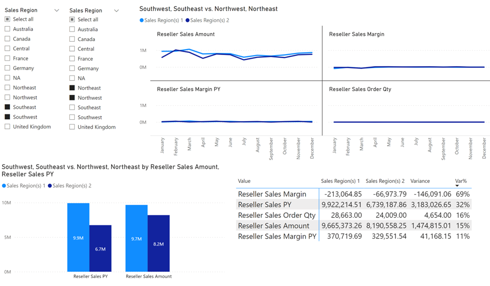
You can use visualizations besides slicers to filter on the measures dimension, allowing multiple measures to be displayed in the same visualization for the selected regions:
This solution could be further enhanced to handle different measures, but different dimension attributes as well.
Posted at https://sl.advdat.com/3xGqTQYhttps://sl.advdat.com/3xGqTQY